

Kraft Paper(Natural Brown)
Natural brown kraft paperboard is an unbleached fiber board prized for its earthy appearance, structural integrity, and natural brand appeal. A practical choice for food outer cartons, gift boxes, paper bags, candle packaging, and eco-conscious brands across many product categories. • The natural brown color comes from skipping the bleaching stage in the kraft pulping process. • Color printing requires design adaptation; foil stamping, white ink, and spot colors perform particularly well. • Used in food packaging, gift boxes, candle packaging, paper bags, and artisan brand applications and more.
What Is Brown Kraft Paperboard? Natural Packaging for Food, Gift, and Eco Brand Applications
Brown kraft paperboard tends to divide opinion. Some packaging designers enjoy working with it; others find the brown surface more limiting than it looks on a mood board. The reality sits somewhere in between — it's a characterful, useful material that suits specific brand aesthetics and certain packaging applications genuinely well. But using it effectively requires some understanding.
What Is Natural Brown Kraft Paperboard?
Natural brown kraft paperboard — also called unbleached kraft board — is made through the kraft (sulfate) chemical pulping process, without the bleaching stage used for white boards like SBS. That skipped bleach step is what gives kraft its distinctive earthy color: the natural shade of wood fiber once it's been chemically processed but not whitened.
Fiber sources vary: softwood species like pine are commonly used for their longer, stronger fibers; hardwood and bamboo can also be part of the mix. Some kraft grades incorporate recycled content alongside virgin pulp; others are primarily virgin kraft. The pulping process does use chemical solutions, so "unbleached" is the accurate descriptor here rather than "chemical-free" — but no bleaching agents are involved, which is what distinguishes it from SBS or other whitened boards.
Color and Printing: The Most Important Practical Consideration
Before committing to kraft, it's worth thinking carefully about print. The brown base surface changes how colors read — vivid CMYK results look noticeably more muted, lighter shades are hard to reproduce faithfully, and detailed photographic imagery rarely survives unmodified on an uncoated brown surface.
Two approaches are standard in production:
White underbase printing — a white ink layer is printed first, then color layers go on top. This creates a neutral base for ink to sit on and brings results much closer to what you'd get on a white board. It adds a printing pass and affects cost, but it's the common approach when accurate color output is needed on kraft.
Design around the brown — brands that work with the surface rather than against it often produce packaging that's more memorable for it. Foil stamping (gold, copper, black) looks particularly sharp on natural kraft and has become something of a signature aesthetic in premium food and artisan gift packaging. White ink-only designs, spot colors, and minimal graphics can all work very well. The key is treating kraft as a creative material rather than a neutral substrate.
Products and Industries That Commonly Use Brown Kraft
Kraft paperboard's natural, unprocessed appearance aligns well with specific brand types and product categories:
Food and beverage — dry goods, tea and herbal blends, coffee, chocolate, organic snacks, baked goods, cereals, and specialty food brands. The natural-looking surface reinforces an honest, wholesome product positioning that many food brands actively want. Kraft outer folding cartons are a standard format in this space.
Personal care and wellness — natural soap bars, bath and body products, herbal supplements, aromatherapy, and organic or artisan-positioned skincare, where the unprocessed look supports the brand story.
Candles and home fragrance — artisan candle brands, reed diffusers, and home goods products where kraft contributes to a handcrafted, grounded aesthetic.
Gift and retail packaging — kraft folding cartons, paper bags, handle bags, mailer boxes, and gift box formats for lifestyle brands, subscription box programs, and e-commerce brands where unboxing presentation matters.
Stationery and creative goods — notebook and journal covers, garment and apparel hang tags, paper bag packaging for creative kits and stationery sets.
And more across other sectors — essentially any application where packaging that reads as deliberately simple, natural, or honest is a better brand fit than something polished and high-gloss.
Available Weights and Structural Notes
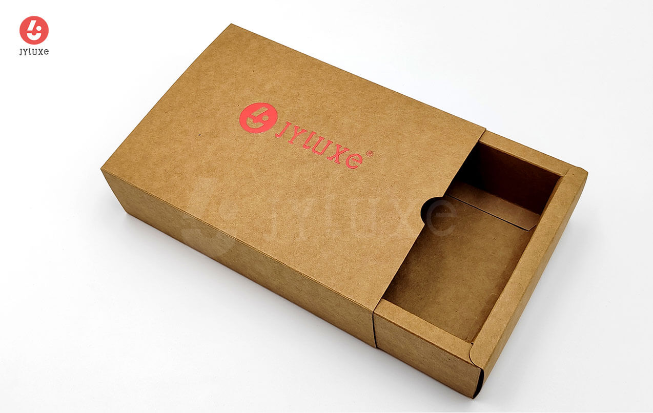
Kraft paperboard is typically available from around 200gsm up to heavier weights for applications requiring more structural rigidity. Lighter weights suit paper bags, folding carton sleeves, and inserts; mid-range (roughly 250–350gsm) covers most retail and food folding carton formats; heavier weights are for packaging that needs to carry more load or hold its shape more firmly.
One often-noted characteristic of unbleached kraft is its structural resilience relative to weight. Because bleaching is skipped, the natural length and integrity of the wood fibers tends to be preserved, contributing to reasonable tear resistance and durability. This is part of why kraft has been a traditional choice for paper bags, mailer cartons, and outer packaging that needs to handle handling and transit stress.
Kraft vs. SBS and CCNB
Kraft vs. SBS — SBS is bleached white and optimized for vivid, color-accurate printing on a clean surface. Kraft is brown, suited to a natural aesthetic, and takes more design adaptation to print well. If photographic imagery or precise brand color reproduction across a range of hues is central to the packaging design, SBS is the more straightforward material. If a natural, artisanal, or eco-honest brand direction is the goal, kraft supports that positioning in a way SBS simply doesn't.
Kraft vs. CCNB — CCNB has a white clay-coated front face for standard CMYK printing and a gray-brown recycled back. Natural kraft is brown throughout. CCNB gives more print versatility; kraft gives a stronger and more distinctive visual identity. They rarely compete for the same brief.
Finishing Options That Work Well on Kraft
Most standard finishing processes are compatible with kraft paperboard. Some work particularly well with the natural surface:
Foil stamping — gold, copper, silver, and black foil are especially effective on kraft and widely used in premium food and gift packaging
Embossing and debossing — creates texture and depth without printing, and suits the tactile character of kraft well
Spot color and white ink printing — works well on uncoated kraft
Die-cutting — standard for custom carton and box shapes
Lamination — possible, though matte lamination (or no lamination) tends to suit the natural aesthetic better than high-gloss film, which can feel inconsistent with the material's character
Custom Kraft Packaging at JYLUXE
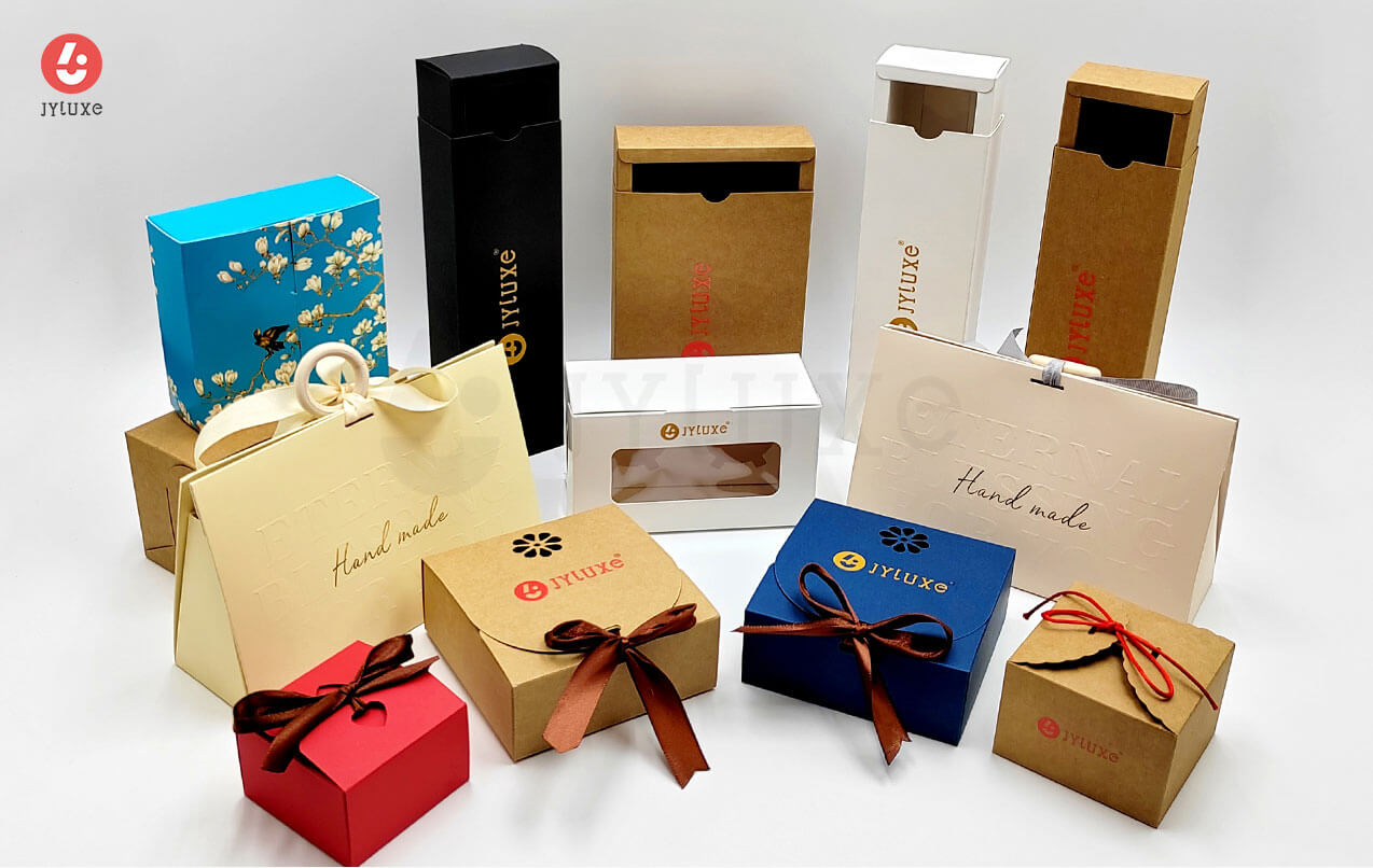
Kraft paperboard is handled regularly across the JYLUXE production facility — covering folding cartons, food packaging cartons, gift boxes, paper bags, handle bags, mailer boxes, garment tags, and more. Established in Shenzhen in 2005, the facility covers over 6,000 square meters with Heidelberg offset presses and full finishing capabilities, ISO 9001 and ISO 14001 certified, with a team of 100+ trained technicians.
For clients evaluating kraft against other material options, print testing on actual board samples — particularly foil, white ink, and underbase color tests — is standard practice and something that can be facilitated early in the project process. Getting a feel for how the material performs with the planned finish is a faster path to a confident material decision than reviewing specifications alone.
Custom projects are handled with one-on-one consultation on material selection, structural design, and production planning, whether it's a single carton format or a multi-format packaging program. Get in touch at jyluxe.com to start the conversation.
Is Brown Kraft Paperboard Right for Your Project?
Kraft makes practical sense when:
A natural, earthy, or artisan brand aesthetic is genuinely part of the brief
The print design can work with (or creatively around) the brown base surface
The application falls within food, wellness, candles, gift, e-commerce, or artisan product categories
Recycled or minimal-process material sourcing fits the brand's positioning
If vivid full-color printing, photographic imagery, or a clean polished white presentation are the priorities, SBS or CCNB are likely more straightforward fits for those requirements.
Kraft isn't a compromise — it's a specific material choice that works very well in the right context and less well in others. When the fit is right, the result tends to be packaging that communicates something a white board couldn't.